
Shopify Conversion Audit: A Practical Checklist for Your Store

So you have traffic, and people seem to like the products, but the orders don't really line up with the visits. That's usually the moment someone says the word audit. A Shopify conversion audit sounds bigger than it is. It's mostly a slow, honest walk through your store with a notepad, looking for the spots where a willing buyer gets stuck.
This post is the checklist version. If you want the bigger picture on testing and strategy, our CRO guide covers that. Here we're just going to go through what to actually look at, in roughly the order a shopper sees it.
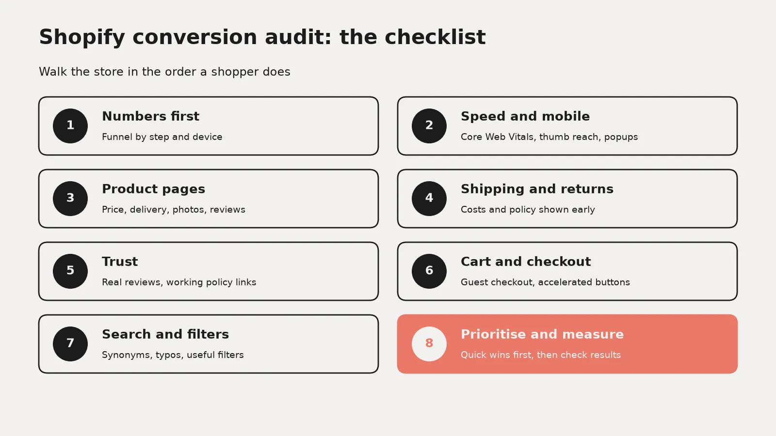
Start with the numbers you already have
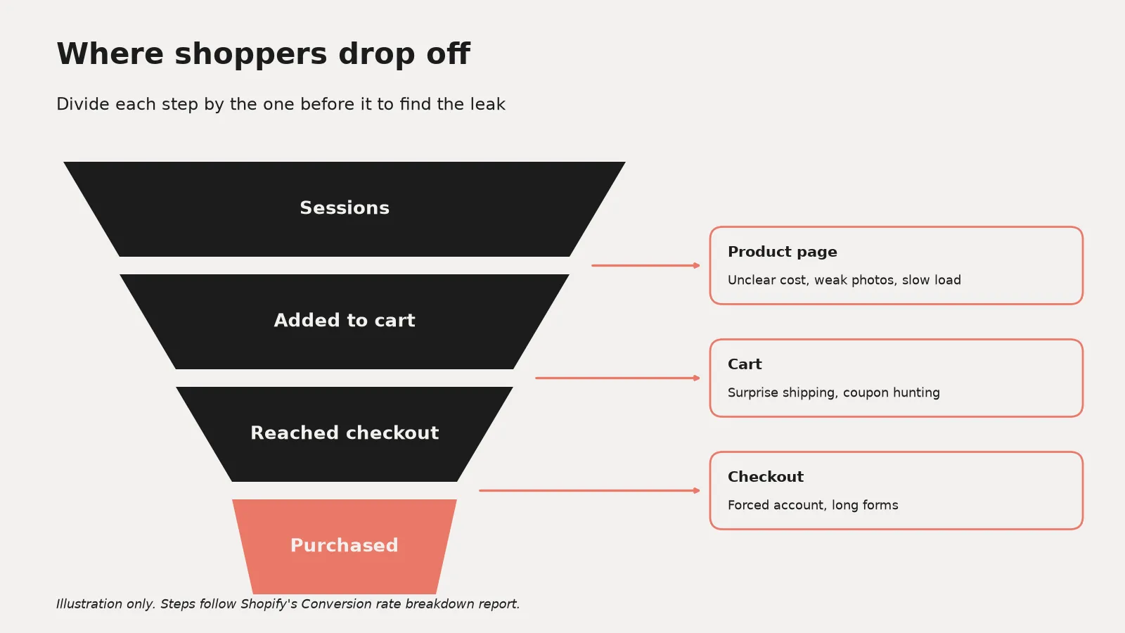
Before touching the theme, open Shopify analytics and look at the path from sessions to added to cart to reached checkout to purchased. You're looking for the step with the biggest drop. And it's worth splitting that by device, because mobile and desktop often tell very different stories.
Don't panic about cart abandonment on its own, though. Baymard Institute's running list of 50 studies puts the average documented cart abandonment rate at 70.22% (last updated September 22, 2025). So a high number is normal. What matters is whether yours is getting worse, and where in the flow people leave.
Set up a funnel you can actually trust
In Shopify Analytics, the Conversion rate breakdown report (it sits with the Behavior reports) shows four steps: all sessions, sessions with cart additions, sessions that reached checkout, and sessions that completed checkout. But according to Shopify's help docs, each step is shown as a share of total sessions, not of the step before it. So divide each step by the one before yourself if you want to see where people actually stop.
If you run GA4 as well, build a funnel exploration with four steps: view_item, add_to_cart, begin_checkout and purchase. Google's Analytics help shows how to break it down by device. Just check those ecommerce events are really firing first, because GA4 doesn't collect them on its own.
Comparing date ranges? Shopify's help docs say its session measurement rollout ran from September 21 to 23, 2026. So treat any jump in sessions or conversion rate around then as a measurement change, not a win or a loss.
Check speed on real phones
Speed is the boring one, and it's also the one that quietly hurts everything else. Google's web.dev guidance on Core Web Vitals (last updated October 31, 2024) says a good experience means Largest Contentful Paint within 2.5 seconds and Interaction to Next Paint of 200 milliseconds or less. It also suggests a Cumulative Layout Shift of 0.1 or less, measured at the 75th percentile of page loads.
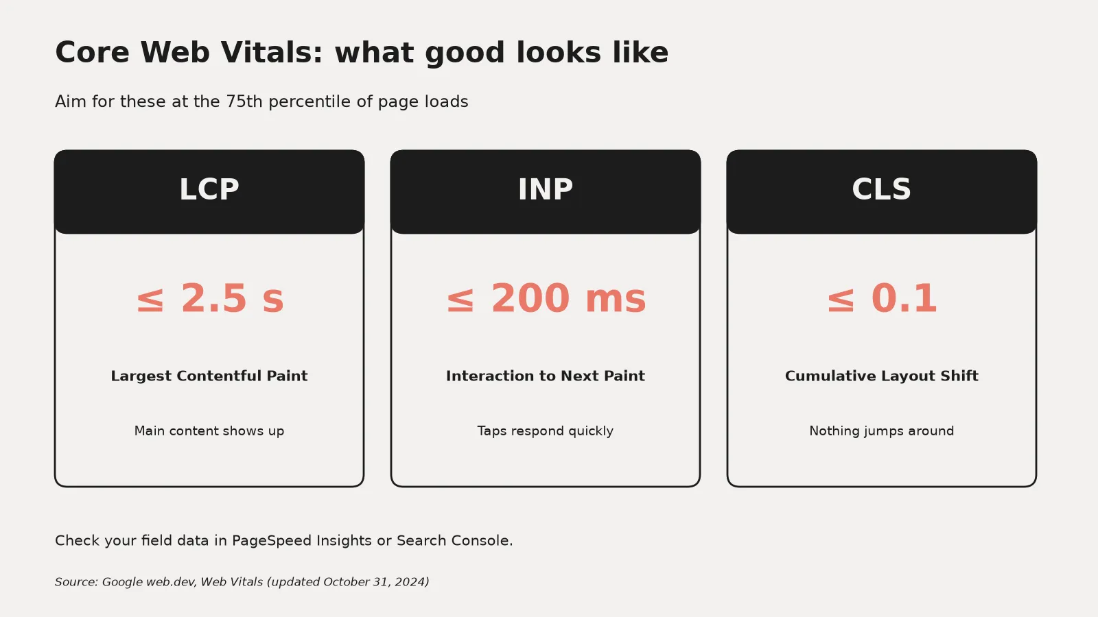
You can see your own field data in PageSpeed Insights or the Core Web Vitals report in Search Console. On Shopify the usual suspects are oversized hero images and apps you installed once and forgot about. Honestly, the app list is where I'd look first. Every app that injects a script onto the storefront has a cost, even the ones you stopped using.
It hurts most on phones. Google's study The Need for Mobile Speed, published on Think with Google in September 2016, found 53% of mobile site visits were abandoned if a page took longer than three seconds to load.
Do a quick mobile UX pass
If phones are a big share of your sessions, give mobile its own lap. Phone in one hand, check this:
- Can you reach the add to cart button with your thumb, and does it stay in view as you scroll?
- Are buttons and swatches big enough that you don't tap the wrong size or colour?
- Does anything jump around while the page loads? That's layout shift, and it's how people tap the wrong thing.
Walk through a product page like a stranger
Open a product page on your phone and pretend you've never heard of the brand. Can you tell what it costs and when it'll arrive, without scrolling forever? Is the add to cart button visible without hunting for it?
Shipping cost is the big one here. In Baymard's research on why people abandon (excluding shoppers who were just browsing), 40% said extra costs were too high, and 12% said they couldn't see or calculate the total order cost up front. So if your shipping info lives on a separate page nobody reads, that's a quick win sitting right there. Put a short line about shipping and returns near the button.
Product media and reviews
Photos do most of the selling on a product page, and reviews close the deal. In Baymard's usability testing, up to 95% of users looked at reviews when weighing up a product, and their benchmark found 34% of sites don't let reviewers add their own photos (Baymard, published August 4, 2020).
- At least one photo that shows scale, like the product in a hand or on a person.
- Thumbnails on mobile, not just little dots, so people know there are more photos.
- Each variant has its own photo, so picking a colour changes the image.
- A way for customers to add photos to their reviews.
Look hard at trust signals
Baymard's same survey found 19% of those shoppers abandoned because they didn't trust the site with their card details, and 13% because the returns policy wasn't good enough. A clear returns line and some real reviews go a long way. And make sure the footer links to policies actually work. You'd be surprised how often they don't.
Make shipping and returns impossible to miss
People leave when the total is a surprise or the returns policy feels shaky. Quick check:
- Shipping cost, or your free shipping threshold, shown on the product page and not only at checkout.
- An estimated delivery window in plain words.
- A one line returns summary near the button, linking to the full policy.
- The same numbers everywhere. Product page, cart, FAQ and policy page should all agree.
Test the cart and checkout yourself
Place a real order. Seriously, do it on your phone, on mobile data, and pay attention to every moment you hesitate. Baymard reports that 18% of shoppers in that group left because the site wanted them to create an account, and 17% because checkout felt too long or complicated. Their testing suggests an ideal checkout can be as short as 12 to 14 form elements, while the average US checkout shows 23.48 by default.
Shopify's checkout is already pretty lean, so most of the friction tends to come from what happens before it. Things like a forced account step, or a discount code box that sends people off to search for coupons.
Turn on accelerated checkout buttons
This might be the most commonly missed quick win. According to Shopify's help docs on accelerated checkouts, you can activate accelerated checkout buttons for Shop Pay and for other providers that support them, like Apple Pay, Google Pay, Amazon Pay and PayPal. Returning customers get their details filled in automatically, and some of these buttons can sit right on the product page so shoppers skip the cart entirely.
Shopify's own docs also warn that hiding accelerated checkout options might hurt your conversion rates. So if you turned them off at some point because they looked cluttered, it's worth revisiting.
Check search and navigation
If your catalogue is bigger than a handful of products, type a few things into your own search bar. Try a misspelling. Try the word a customer would use instead of the word your team uses. If search comes back empty, that's a lost sale that never shows up as abandonment, because the person just leaves.
Baymard's 2026 search benchmark (updated April 29, 2026) says roughly half of participants in their testing go to search first to find products, and 56% of sites fail to properly support what those people search for.
On Shopify, the free Search & Discovery app covers most of the basics. According to Shopify's help docs, you can set up synonym groups so different words return the same products (their example is slings and belt bags), feature certain products for certain searches, and add filters to collection and search pages, up to 25 of them.
- Look at what a no results page shows. It should suggest something, not just shrug.
- Make sure filters match how people shop your catalogue: price, size, colour, whatever really matters.
Write it all down and pick a few
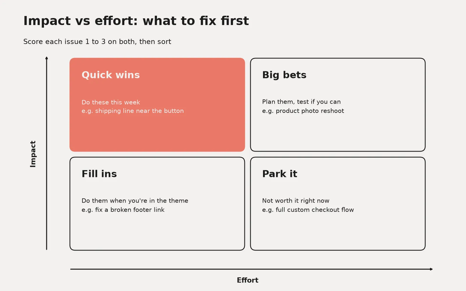
An audit is only useful if something changes afterward. So once you've gone through the list, rank each issue by how many people it touches and how hard it is to fix. The easy, high traffic stuff goes first. The rest can wait for a proper test, which is where the CRO guide picks up.
Here's a simple way. Give each issue two scores from 1 to 3. Impact is how many shoppers it touches and how close to the purchase it happens. Effort is how long it takes and who has to do it. Then drop each one into a box:
- High impact, low effort: quick wins. Do these this week.
- High impact, high effort: big bets. Plan them, and test them if you can.
- Low impact, low effort: fill ins. Do them when you're in the theme anyway.
- Low impact, high effort: park them.
What to measure after you fix things
Before you touch anything, write down the numbers for the step you're fixing. Then check again after two to four weeks.
- Step to step rates from the Conversion rate breakdown report, split by device.
- Overall conversion rate, plus average order value so you can tell if a change just shifted order size.
- Core Web Vitals field data in PageSpeed Insights or Search Console after speed work.
Change one big thing at a time where you can, compare the same days of the week, and look for a trend, not a spike.
If you'd rather have someone else do the walking, that's a big part of what our Shopify ecommerce consulting is about.
Want a second pair of eyes?
Book a call and we'll look at your store's biggest drop off point together, then talk through what to fix first. Book a call here.